Richman Photo Art
  • Home
  • News
  • Portfolios
    • New Jersey Landscapes
    • Arthur Kill
  • Galleries
    • Bridges
    • Courthouses
    • International Travel
    • Natural World
    • Sunrise/Sunset
    • Traveling the USA
    • New Jersey
  • Through the Lens
  • The Photographer
  • Contact

Effective Silhouettes

12/21/2018

6 Comments

 
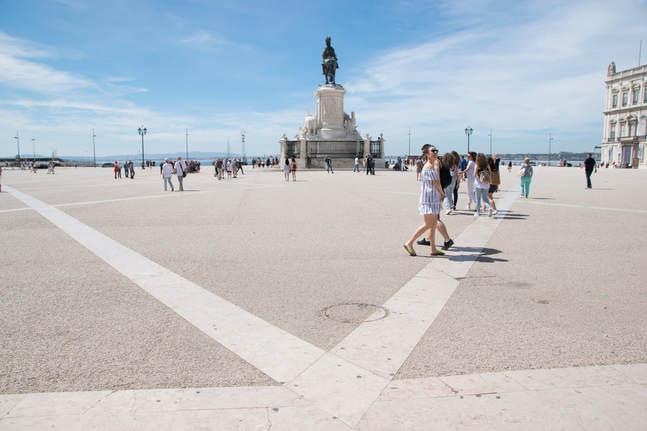
Photographers are often too obsessed with details, wanting to make sure that shadows or dark colors are not just blobs in the image.   Occasionally the goal is to get a subtler approach by either exposing for the dark, using bracketed shots that offer a range of exposures in quick exposures one after the other, or otherwise using post-processing software to bring it out.

Sometimes, though, the shot works better as a silhouette or with barely noticeable detail.  This is because too much information can be distracting.  If we want impact, the impact of a small outlined figure against an essentially uniform expanse provides the pop.  In this way, the image can succeed as a minimalist images in which a particular detail is set against an uncomplicated background. 

Here is an example from Barcelona, of a woman on a paddleboard.
Picture
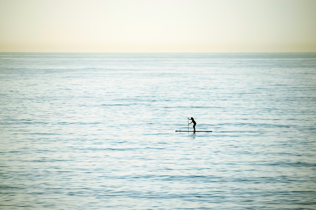
I did several things to create a photo that had sufficient contrast to have an impact.  First, I did not do a close up of her; the isolation of the paddleboarder against the expanse of sea was the subject of the photograph.   Second, I put her off center and slightly towards the bottom, and had more sea than sky to further break it up.  Photographers are often told of the Golden Ratio or Rule of Thirds which divides the image into three rows and three columns.  Under this rule, placement of the main subject anywhere but in the center is considered better practice to break the symmetry and create a tension in the image.  Like all rules, it can be broken successfully, but in this case, I put the person more to the right, since it follows another recommendation which is to leave space for a person in motion to move into.  Sometimes symmetry can have an impact, but here I wanted her off center horizontally to create a sense of movement but more centered vertically to increase the sense of isolation—at least that is how it appeared to me.  If she were completely centered, she might seem "stuck."

Another example is from Abuja, Nigeria, of two men padding on a lake, where I also put them off center.  However, there is not the sense of isolation here, and the silhouette is not perfect.  There is color visible on one of them.  While I liked this image because of the sense of purpose and camaraderie demonstrated by the two paddlers, it doesn’t work in the same minimalist way as the Barcelona photo.  

Picture
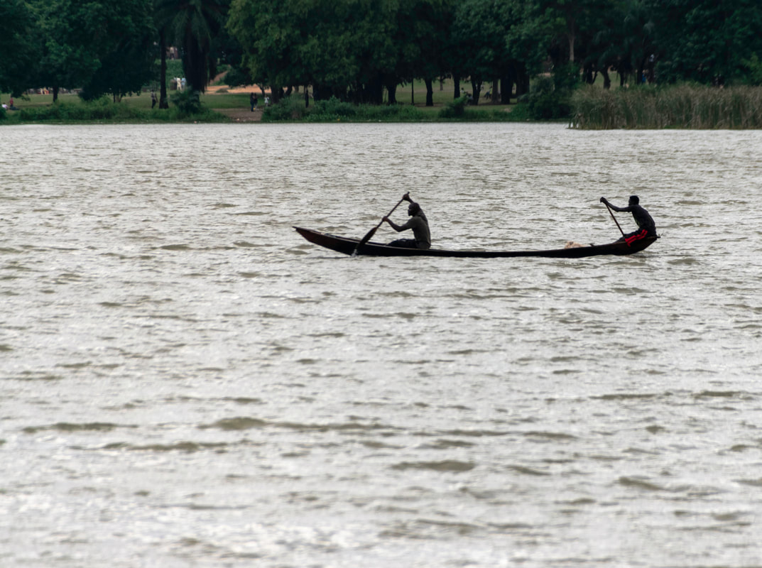
It remains an interesting photograph to me, depicting something of life in Abuja but the one taken in the Barcelona is, in my opinion, more powerful.

If you are going to do a silhouette, consider it as part of a minimalist exercise, so the viewer focuses essentially on just two elements—the silhouetted figure and the background.
6 Comments

Old Cameras—New Cameras

12/3/2018

16 Comments

 
It is not always easy to resist the siren call of the newest cameras with all the bells and whistles with a price tag to match.  Of course, there are qualitative differences between lower end digital SLRs and higher end professional cameras but at a certain point, the qualitative difference in the raw image can be indiscernible. 

You can test this with your own history.  I switched from an Olympus OM1-N camera to a Nikon F70 and then the Nikon F80 until I switched to digital.  I then used a Nikon D50 and then Nikon D70, before moving to Nikon D5100 and then the Nikon D5300.  Each stop of the way I was tempted to go to the higher end models.  After much consideration, I concluded that I would never use a lot of the features of these newer models, and the models I use have all of the core things that I need. 

I believe, as do many others, that it is better to focus more on the lens than on the camera itself.  We are now seeing the pressure to move to mirrorless cameras as the next step.  To some extent, cameras are becoming like mobile telephones in which the main function is just one more function along with all the other things those pieces of equipment provide. Do you need that in order to be a better photographer?  I don’t think so.  A good photographer can take a good picture with an adequate camera and lens, but the technology itself will not turn a mediocre image into a “wow” image.

If you think about it, when the Olympus OM-1 was the mainstay of the working photographer, world class images were captured and made.  While the Nikon D70 could not do many of the things that the top-line Nikon camera can do today, at the time it was far more advanced than a far more expensive camera of 15-20 years earlier.

Here is an example.  This image of a canal boat pilot in Amsterdam was made ten years ago, in 2008, with a Nikon D70.  The D70’s highest resolution ISO was 200; this was shot at that, and at 1/400 second with F5.6.

Picture

As processed, I produced this image.

Picture
A pro-am digital SLR today would have more pixels available, more autofocus points, and a faster ISO, but one would be hard pressed to challenge the quality of the original capture or the overall result in showing this character portrait of this man.  These older cameras have had their place, have produced first rate digital negatives, and while it is good to keep up with the improved technology, that technology will not make the image for you.  Some of these older cameras, which were advanced for their time, may have more utility than some of the new cameras, and serve as excellent cameras both for training and artistic purposes.

16 Comments

Making A Photo Unique

8/9/2018

9 Comments

 
So how do you approach one of the most photographed places and make it new, unique, or especially interesting? I confronted this in Chicago recently.  The Loop is the heart and soul of the city, an outdoor museum of architecture and grit, of industry and culture.  In the canyons between the skyscrapers, extremes of light and dark make exposure difficult.  The relative narrowness of viewpoint in streets controlled by the El impact on the ability to get a full view of the streets or the buildings.  I wanted to capture Jewelers Row on Wabash Street.  With the limitations of angle, I looked for something different.  The texture of this particular sky at this moment, with this lighting, cooperated.

I like to shoot the signs identifying a neighborhood as, in my opinion, they seem to give a validity to where you are.   I decided to turn this into a vertical image and capture the surrounding buildings, framing the sky.  The sky, with clouds, formed its own pattern, and by judicious use of the filters in Lightroom (particularly the dehazing one) I was able to achieve a vibrant sky.  The upward thrust of the buildings—itself not perhaps particularly original—nonetheless is different here because of the sky and the use of the sign and lamppost.  In other words, while we all may like the dramatic effect of capturing skyscrapers and sky like this (or tall trees in a forest), we should remain cognizant of the foreground or anchoring feature of the image.

In this one, we have the El—more a suggestion—in the lower left corner, the focal point of the lamppost and sign identifying clearly where we are, and the view of Jewelers Row not as the full street, but in a vertical viewpoint.  We have a vivid sense of being in the Chicago canyons of the Loop, and of the particular character of this street.


Picture
How do you manage to make an image unique when the subject matter is familiar to so many people?

9 Comments

Photographing the Street

7/5/2018

5 Comments

 
Many painters over the centuries have captured the street in painting.  The enduring popularity of such works might inspire the photographer to also capture the personality of a city in this way, however, the traditional long view may not be the best way to photograph a street.  You have to think about what it is that strikes you.  Is it the emptiness of a residential area at a particular time of day? Is it the architecture? Is it a set of patterns? What it is that interests you will determine what is the best image.  Of course, you can shoot multiple images so that you have them and I often do that. 

If we want to see the street as a whole, then perhaps a traditional view is to look down the street from the center, like this street in the St. Hanshaugen neighborhood in Oslo, Norway.

Picture
This is a basic documentary shot, meaning that it is not meant to do more than show the street and the buildings on either side of it.  The photo gives the viewer a feel for this neighborhood of the Norwegian city but it is perhaps on the mundane side.  Someone can look at it and understand, from a factual perspective, what this street looks like.  The sky is a dark blue and adds a color interest.  Of course, a narrow cobblestone street with centuries old buildings full of character would be more interesting but that is not this street.  So if we want to capture this street, this long view does not really do much except to show us in straightforward fashion what it looks like.

A second way to capture the street and perhaps afford an edgier tone to the image is to shoot just one side of it.

Picture
I eliminated a less interesting side of the street (which had just one visible gray building and an area obscured by trees) and focused on the more colorful and varied buildings that also create a discernible pattern. The road itself—just a patch of black—fills less space than in the prior image.  The eye is drawn down the length of the buildings by the force of perspective.  There is still a sense of the neighborhood, its architecture, and the tone.

Another option is to approach this in the same manner as abstract painters who seek to reduce the representational or documentary nature of an object by capturing it abstractly.  Consider this:

Picture
I have reduced the street to an abstract pattern of parts of three of the buildings.  I no longer have a postcard style representation of the street either from the first or second image. 

The point is that when photographing you should be alert to the possibilities and effects that can be achieved by simply framing, without fancy image processing.  You can take a purely documentary image or you can seek to capture something else by abstraction.  You are also not limited to these three positions—storefront shots and shots showing just the door and some windows on the first floor are other options.

I’d be interested in comments on which shot strikes a chord, and how you seek to capture parts of a city like this when traveling.
5 Comments

Horizontal versus Vertical

4/11/2018

4 Comments

 
Most photographers seem to default to the horizontal viewpoint.  Even for landscapes, where horizontal is the normal reaction to achieve a panoramic effect, vertical images can be just as effective, particularly where close-ups of trees or other tall objects are involved.  Another way to express it is landscape versus portrait.  An alternative is also the square image, neither wider nor taller, but all sides being equal.  We tend to default to horizontal (landscape) because that is how we view the world: our eyes are horizontal, not vertical.  Computer monitors and films are set in horizontal mode.  Vertical requires us as well to turn the camera and is better for capturing tall objects without extraneous space on the sides, and more detail of the tall object.

Those basics aside, and without running down the millions of hits you get if you run horizontal versus vertical photographs through a search engine, perhaps we can just do our own captures and see what we think about them.

Here are two from Vilnius, Lithuania, where I wanted to capture the locks that people place on bridges as signs of their love for each other.  I shot it twice on this bridge, one horizontal, the other vertical, with different locks in the image.

Picture
Picture
A few points.  I could have stood back more and included more of the bridge on the horizontal image, but that would have rendered the actual locks smaller.  Or if I had been closer to the bridge to get that detail, I would have lost some of the background.  I felt the setting was as important as simply focusing on the locks.  More to the point, the horizontal image allowed more locks to show, adding not only variety but showing how many were on the bridge, even in this limited space.

On the other hand, the vertical has fewer locks but, in this case, I was able to feature three locks up close.  If I had done that as a horizontal, I’d have lost the background.  Here, I was able to keep the background.  As it happens, I have no strong feeling one way or the other as to which is the better or stronger image.  If I had to choose, I would pick the vertical, perhaps because it balances a high level of detail of the locks, which was important, with sufficient background to establish setting.

Why is the background important? We like to think of the subject in terms of the simpler, the better, but here the locks stand in place of the people who put them there, and through the locks we see what the couples saw as they placed the locks.  To that extent, the background and setting are equally part of the story.

Too many times we see something interesting and just take one shot.  We are told to move around and look for other angles.  We need to remember that it is worth taking it from the vertical as well as the horizontal perspective and having the option later.  Sometimes we can accomplish that by cropping but that can lose too much of the image.  Get the full image at the time, both ways.
4 Comments

The Wide Angle Lens

3/10/2018

5 Comments

 
A wide angle lens has a short focal length that provides a wide view.  On a digital camera, it can range generally from 10 mm to 35 mm.  The standard or normal view lens of 50mm translates to the 35 mm on the digital camera.  A prime lens is a fixed focal length, such as 35 mm, and a zoom allows for variable lengths.  Photographers hold strong opinions on these things; some despite zoom lenses and others swear by them.  Some will urge the use of the wide angle lens and others will warn you of all the mistakes if you don’t properly use them.  As with my other blogs, I walk the trails alone.  I will run a search on my inquiry, such as pros and cons of the wide angle lens or the fixed/prime debate, and then trust my eye.  Ultimately, you can judge whether your final image meets your standards and those whom you feel you need to satisfy.

I like using the wide angle lens, and spent time working with the Nikkor 1-20mm f/4.5-5.6 G lens.  I was told originally that unless I was using it for landscape, I would not find it useful.  However, while it certainly has its uses in landscape, it is a vital component of the urban photographer’s kit.
In Philadelphia’s Locust Street, I found a pair of photogenic doors.  I did not want to angle them but even with at 20 mm I could not get them both in at frontal view without having a lamppost between them.  Here is that image from across the street, not cropped, but processed in Lightroom with basic adjustments and with perspective straightening.  If I wanted to use this image, I felt I would want the full lamppost to at least make that part of it rather than just a cut-off gray pole:

Picture
Crossing the street and standing with the lamppost to my back, even if I’d used my preferred lens of choice, the Sigma 18-250 mm, I could not get both doors in the photo.  Using the Nikkor 10-20 at 20 mm, I get this (again, with basic adjustments and straightening):

Picture
At 10 mm, I can get what I wanted originally—the two doors.

Picture
The lesson is that with proper control and a mind to the software processing tools, the wide angle, particularly at 10 mm, is a valuable lens for capturing details in the confines of a city and on narrow streets.  I cropped to minimize what remained of slight bulging of the frame, although it is not always the camera but instead the settling of the house that can affect the shape and lines.  Also, to the extent some may still find slight distortion, I’d also note that distortion is not always bad, nor are those converging verticals that can lend dramatic effect.  My focus and intent was to depict the contrast and complementary nature of these old doorways.  There are a lot of articles on the dos and don’ts of wide angle use.  Read them, think about them, but most importantly, consider what it is you want to accomplish.  Always at the end of the day, it is your eye that matters.
5 Comments

The Three Shot System

2/3/2018

4 Comments

 
 I read somewhere many years ago that it is a good idea to shoot an object from three perspectives. It is worth emphasizing and exploring because the most basic of ideas sometimes get overlooked.

The concept is that one shot situates the subject in its environment, the second is the entirety of the subject in isolation, and the third is a detail of the subject. For example, I have a courthouse series in which I photograph courthouses around the world. One photo is usually of the courthouse that shows its location, either in the center of a city block or on a square, with the courthouse itself not filling the entire frame. The focus is on the entire building in the second. The third shot may be of just the doors or one of the symbols of justice that may be on the dome.

The method is not limited to architecture.  A landscape may show a broad area, particularly with a wide angle lens, then a more defined portion that is still broad enough to show the vista, and finally, a tree or rock may be isolated.  Street photography works the same; a broad shot of the entire street in context, a more focused image of several storefronts, and finally, a particular window, door or sign. By having the three images, we capture the overall impression, a study of the subject, and a detail that sheds light on the personality.

As an example:

Picture
Picture
Picture
These are images of the cranes at the container port in the Arthur Kill on the Staten Island side across from Elizabeth, New Jersey. The first photo shows the four cranes in context and tells us quite a bit about the industrialization of the area. It is a location shot and also shows the airplane in the far right corner to add to the image of transportation. The middle photo focuses on the subject matter, isolating the four cranes. If the first is more of a stock photography image, the second is more of a documentary shot. The final photo focuses on the details of the cranes, creating more of an abstraction.  I left it as a color image to contrast the red and blue interplay.

It’s just something to think about as you approach a subject and makes for a good exercise in training yourself to see the many different opportunities.
4 Comments

Dealing With Color

1/15/2018

4 Comments

 
Sunsets and sunrises provide endless variety. The same physical location will always yield a different cloud formation, and the shades of the colors seem to change by the second.  Exposure remains difficult where there are dark aspects, whether by clouds or foreground. We also don’t want to spend time making adjustments and risk losing the best of several sequential shots.  Fortunately, we have the ability in post-processing to address this issue. The tension is between retaining the reality of the vision while bringing out the inherent color that we don’t see in the original exposure.
 
Take this example. This is the as shot image of sunset off Montego Bay, Jamaica.
Picture
There is little contrast here and the image is flat.  We can see hints of red in the lower clouds and some yellow and red on the horizon.  Compositionally, while the sand and small structure are darker, I liked the lone figure at the far right to add a sense of proportion and more meditative aspect to the image.
 
I used Lightroom to make basic adjustments to set white and black points to increase the contrast, clarity and vibrancy. More importantly, I worked the luminosity and saturation filters of the color controls. While increasing luminosity brightens an image’s color, decreasing it thickens the color, and when combined with saturation, makes more visible what is already there. You can then readjust vibrancy if it starts to look artificial. In these situations, subtlety is important, but you also want the image to pop. You also generally don’t want to make it artificial. You can work with shadow filters to bring back some of the detail in otherwise dark areas. Here is what I ended up with:

Picture
This brought out the yellows in the clouds above and to the right.  Maybe I could reduce the saturation and increase the luminosity of the orange more, and render it more subtle, but this brought out the reflection in the water.  I made very slight adjustments using split toning.  It is always good to compare the original to what you are doing as a reality check.  I used the sharpening and luminosity sliders and masking in Lightroom, and finished off with the high pass sharpening for more subtle adjustments.
 
I am a firm believer that less is more, and care always needs to be taken to not overdo it, lest you turn your “wow” picture into a cartoon.  Unless, of course, that is the effect you want.


4 Comments

Taking the First Shot

1/1/2018

3 Comments

 
Based on feedback, for 2018 I will concentrate this blog on more practical aspects of photography. For this first blog of the new year, I address one of the old chestnuts of photography:  Don’t take the first shot that presents itself.

We hear this all the time in photography clubs and in instructional books.  Move around.  Get various viewpoints.  Wait until the decisive moment appears.

It is true that we may take 1000 pictures and end up with only three or four that are truly memorable and evocative—the wow shots. It is also true that where the opportunity presents itself, it does pay to move around the subject; perhaps wait to see if certain people move away or the sun breaks through.  Any number of factors impact on the ultimate image.  However, the advantage of digital photography is such that there is no impediment to taking that first shot.

We often round a corner, take a curve in the road, or arrive at a lookout point, and we are struck immediately with a view.  I like to take that picture because it captures immediately what I saw and what was—in that moment—the wow image.  I then move around, look for a better angle, perhaps one that avoids an obstructive element I now notice.  Maybe I won’t use that first image.

But I have also experienced situations where, having hesitated to wait or look for the better shot, I have lost it entirely.  The person whose face was filled with character has now seen me, and the expression is gone.  The clear view is now gone because a truck has parked in front of the interesting building.  The sun vanishes behind a cloud.  And so forth.

Take the first shot.  It may be the only one you get.  While I generally agree with the conventional wisdom that you should get the image as well as you can in the camera, the reality is that there is much that can be done in the processing of an image—particularly and most simply in cropping and straightening.

Here’s an example.  The first shot is made just after I emerged from the arch leading to Praça do Comércio (Commerce Square) in Lisbon, Portugal.
Picture
 
It is unprocessed here.  I may not have snapped the instant I went through the arch, but instead gathered my bearings, absorbed, and then shot.  It is facing the ocean, but we do not really see the ocean.  It has people in a random position that do not add anything to the image.  It is asymmetrical, with part of a building on the right but not showing the comparable building on the left.  It does show (and reminds me) of the impression of the vast, bright, clean nature of the square.  It is like a diary entry.  I could do things with this (e.g., straighten it, and crop it so the “v” is more symmetrical).  It is not necessarily a bad image, but it may not be the best.  Nonetheless, I have it.  And maybe on reflection I like the people in the foreground I’ve captured, who would not have been there had I hesitated.

It is a large square, and I spent time shooting it towards the ocean and back towards the city, focusing on this side and that side, on details and the broader picture.  I went up to the observation area on top of the arch, and of all the pictures, found this one preferable to present what initially impressed me about the square.
Picture
I think this is a better image.  But I’m still glad to have that first shot so it did not join the list we all have of the ones that got away because we hesitated.
3 Comments

Life Imitates Art

6/25/2017

10 Comments

 
​In 1927, Alberto Giacometti sculpted The Couple, a bronze case symbolizing, if more abstractly representing, a man and a woman, borrowing from more primitive or tribal work.  The Museum of Modern Art in New York notes of this piece that “[t]he pairing of male and female figures announces what would become one of Giacometti's great, lifelong subjects: the encounter between men and women, life and art.” I have converted it to a black and white image to emphasize its detail, not its color, and allow comparison with the second image.
Picture
©Steven M. Richman
Picture
©Steven M. Richman
They struck me as clearly a couple but who are remarkably disconnected as they each focus on their phones.  Nonetheless, they are in proximity but also disconnected from each other.

The more one is exposed to art, the more the patterns of existence reveal themselves.  Various photographers today concern themselves with stretching the medium.  I continue to believe there is a place for “traditional” photography, exploring like Giacometti a particular subject, in its myriad and endless permutations.

10 Comments
<<Previous
Forward>>

    Author

    Steven Richman is an attorney practicing in New Jersey. He has lectured before photography clubs on various topics, including the legal rights of photographers. His photography has been exhibited in museums, is in private collections, and is also represented in the permanent collection of the New Jersey State Museum. ​

    Archives

    January 2022
    September 2021
    August 2021
    March 2021
    January 2021
    November 2020
    August 2020
    May 2020
    January 2020
    August 2019
    June 2019
    May 2019
    April 2019
    February 2019
    January 2019
    December 2018
    August 2018
    July 2018
    April 2018
    March 2018
    February 2018
    January 2018
    June 2017
    May 2017
    April 2017
    March 2017
    February 2017
    January 2017
    December 2016
    November 2016

Proudly powered by Weebly